Virtual Mailbox
This virtual mailbox is a third-party software for users to access their personal and businesses from different states virtually. We aim to improve the platform's user experience by expanding and revamping our 'Advanced Search Filter' and identifying other user experience issues.
This service offers greater flexibility and convenience, as users can access their mail from anywhere in the world. By improving the user experience and user interface of a virtual mailbox, individuals and businesses can efficiently handle their postal mail, leading to a more organized and streamlined approach to traditional mail management.
Timeline
December 2021 - August 2022
My Role
Lead Designer
Platform
iOS, Android & Web Design
Problem
These is a list of problems we’ve identified the most that needed change thus we focused on what has the highest feedback we gathered first.

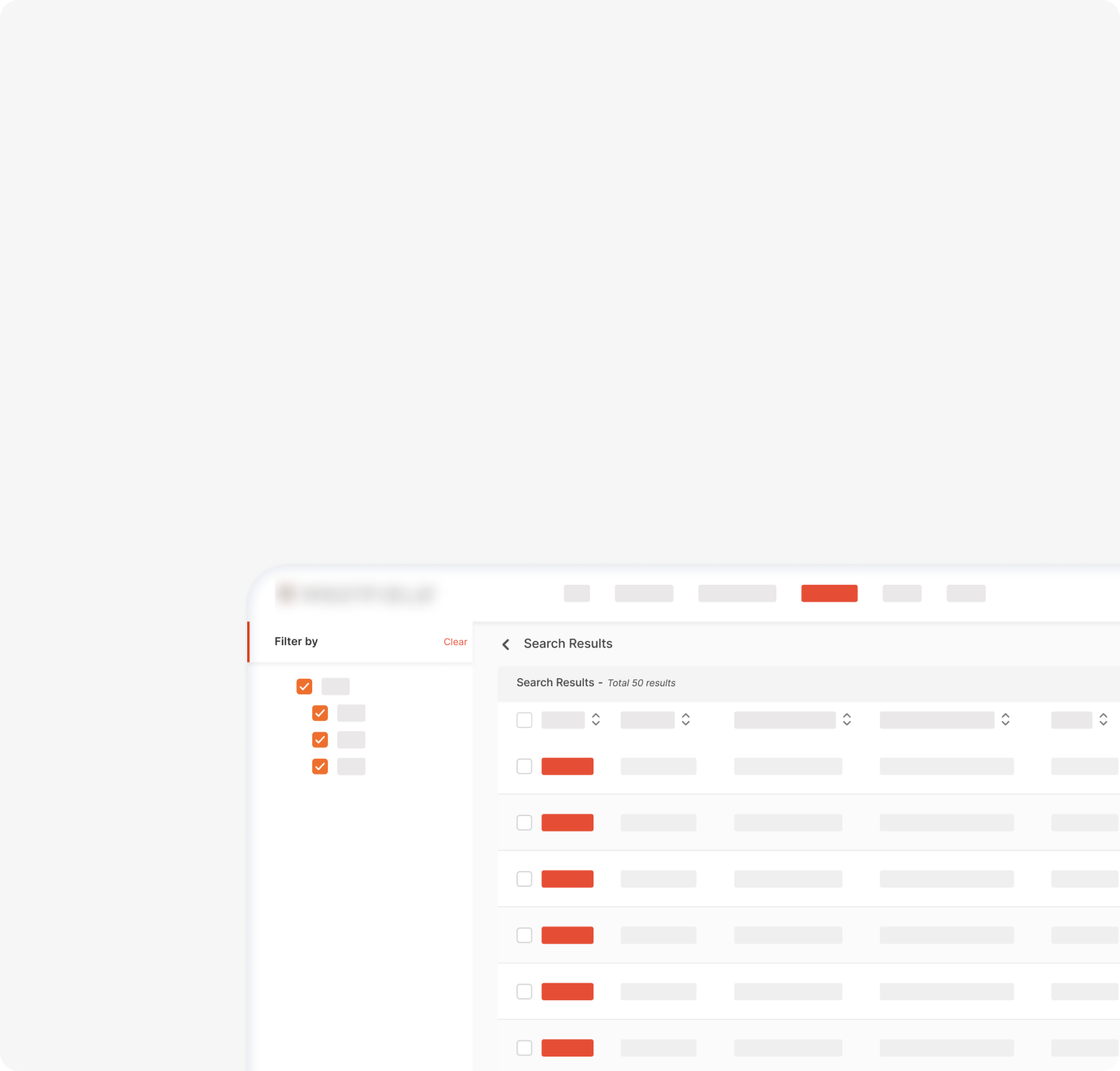
FILTER OPTIONS
The platform does not offer a section for filter(s).
EXAMPLE
The platform shows only a piece of rigid information about the service which makes it difficult to immediately understand a user’s option for a specific service.

ADVANCED SEARCH FILTER
The platform does not offer a section for filter(s).
EXAMPLE
This section only shows a general option for selecting a location. When this happens, the user’s choices pose limits when there is a variety.

LACK OF VISUAL GUIDE
There is no consistency/clarity of what a plan can provide a user.
EXAMPLE
When a user views a service lack of visual cues can make a user frustrated.
Defining the Problem
How might we redesign a better experience for customers to navigate the platform’s services with ease?
Goal
Increase customer retention through filter options
To ensure that the customers understand the content presented from locations to services and to work with the engineers on how we can sort the users’ demands/relevancy.
Create ease with the ‘Advanced Search Filter’
To give consumers a concise representation of how the user journey should proceed from the start to the end of the service experience.
Strengthen clarity while navigating on the services
To work on a design system to reduce technical debt and to give the users a clear, consistent experience.
Process
It was more of a one-man team for the design team. Since the company is in its semi-startup state, I was the only designer on the team. Working closely with the CTO and Software Engineers to conduct the solutions and sketch out ideas that fit.
To validate my findings, I would do guerrilla testing or directly ask the stakeholders. I would also create iterations immediately after I’ve gathered my findings.

User flow
We mapped out the user flow based on the ideal flow, we also needed to upgrade the cues and elevate the experience by adding clearer visual cues and other factors that might lead to users abandoning the pages-- which was also added in the improvement of the architecture.

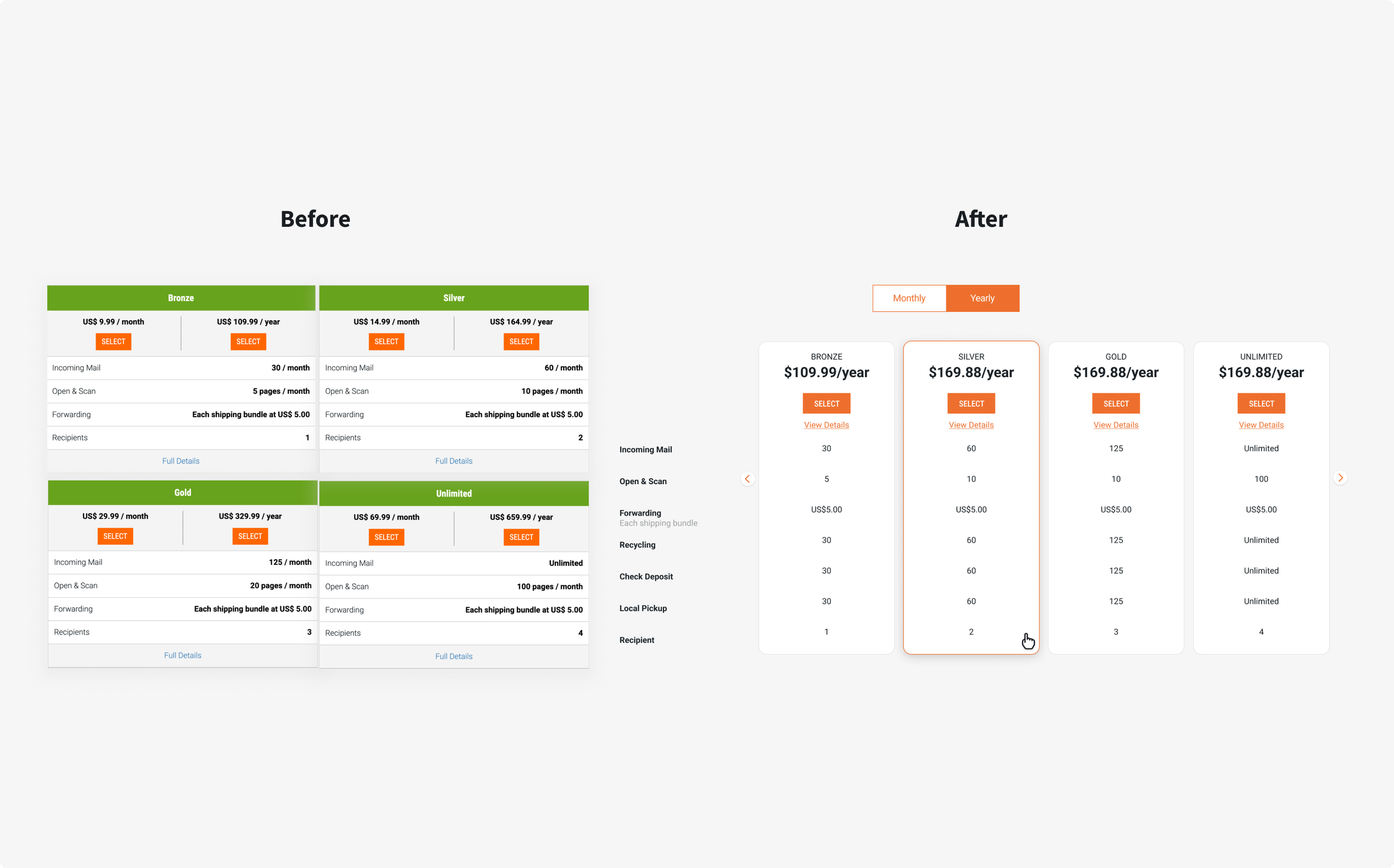
Early designs, solutions
We’ve consistently explored different looks and experience flows for the users and tested some of our theories. Below is a sample of different solution boards I’ve presented to our stakeholders.

Usability Testing
One of the restrictions that challenged me most was the inability to have a window for user testing so, to tackle this situation, I made sure that I tested my theories as often as I could with different departments or created Guerrilla Testing for small groups outside the company to validate my designs.
Final Designs
Here’s a rough walkthrough of the final designs.


Conclusion
I’ve yet to find out the official beta release of this product change. A lot of the obvious concerns are the bug fixes that we need to address before and post-launch. It is also crucial to keep iterating based on the feedback we’ll be getting from the public.
Next Steps: To follow through the user journey roadmap and continue optimizing the design system to promote consistency and scalability of this product.
*Want more insights on this project? Send me a message.